Knoll by Vignelli
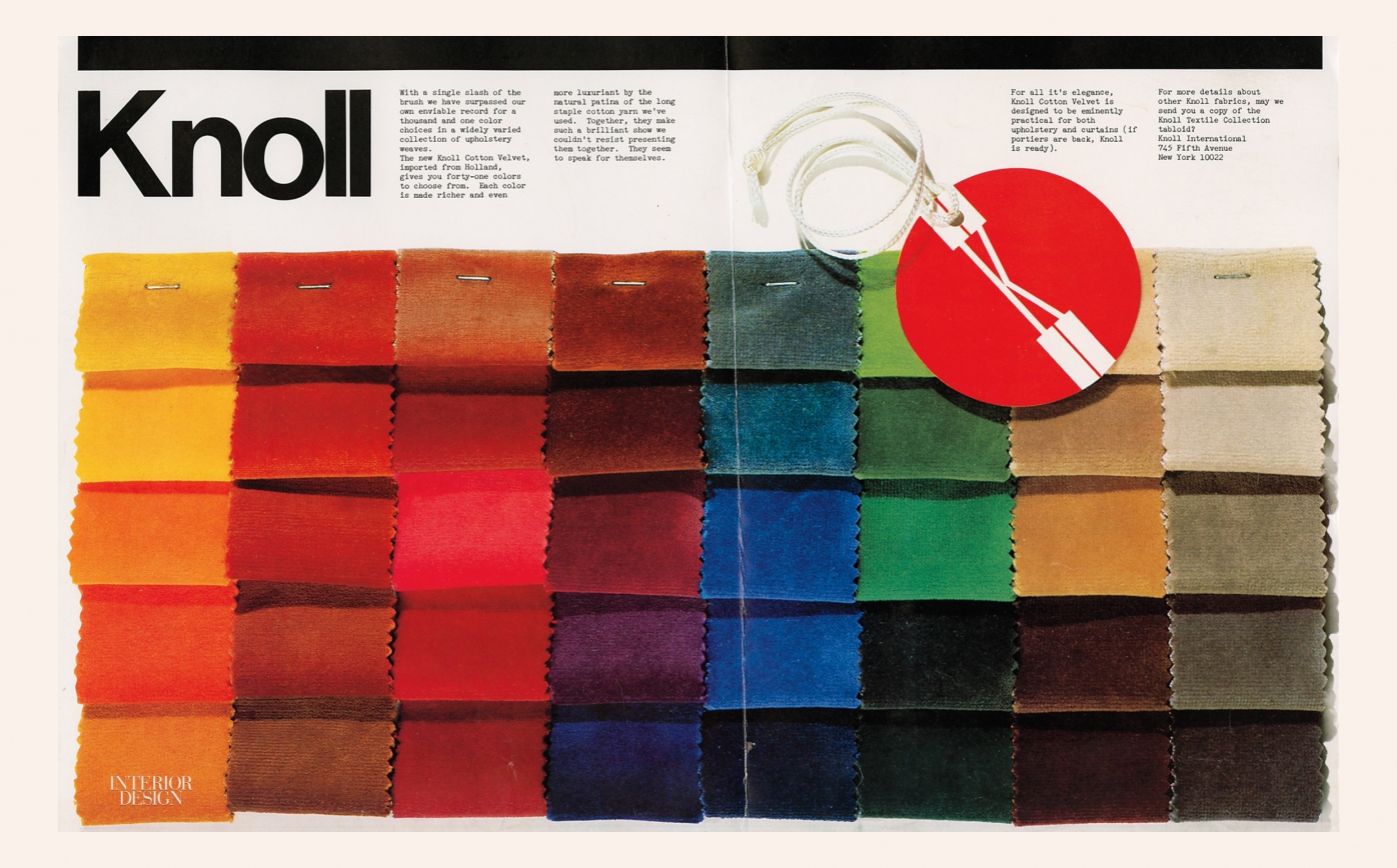
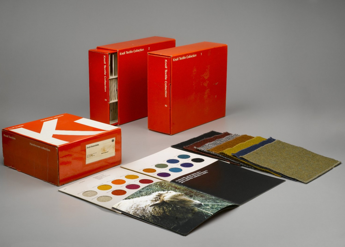
In 1967 Massimo and Lella Vignelli were hired create a new graphics program for Knoll. The resulting designs, based largely on a grid, provided the foundation for all basic communication needs, including stationery, business cards, stickers, tags, boxes, brochures and four-colour ads for trade magazines and publications like The New Yorker, Vogue and Fortune.
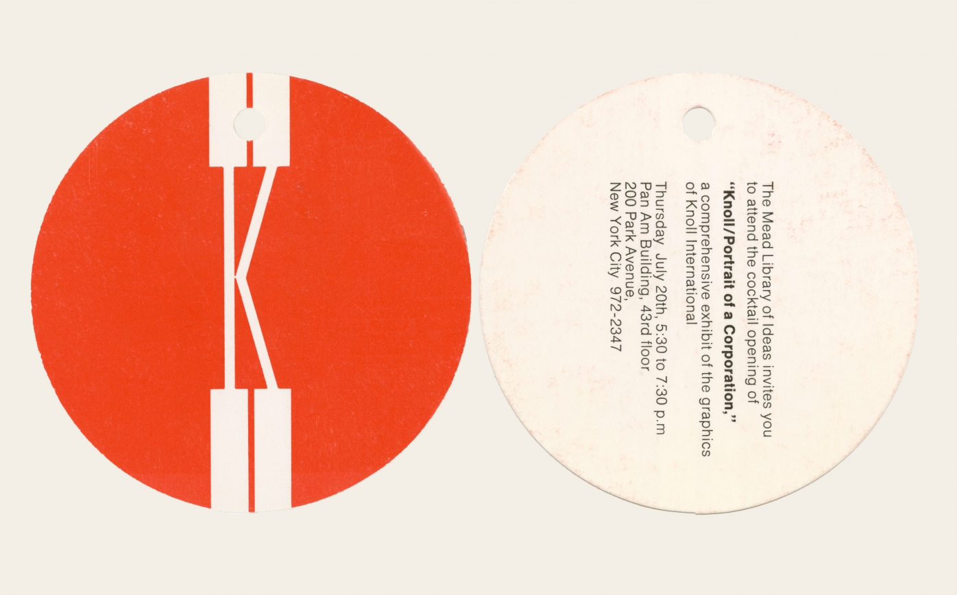
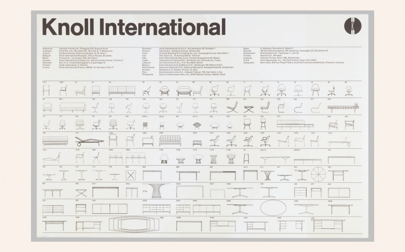
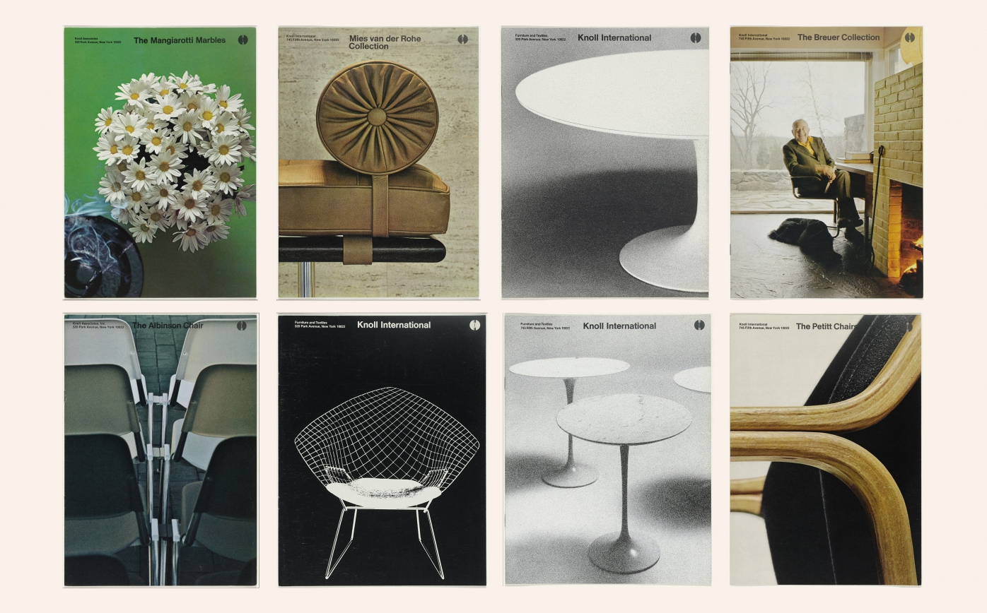
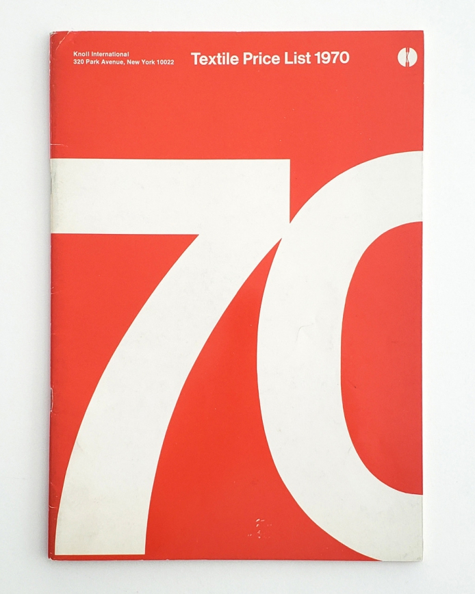
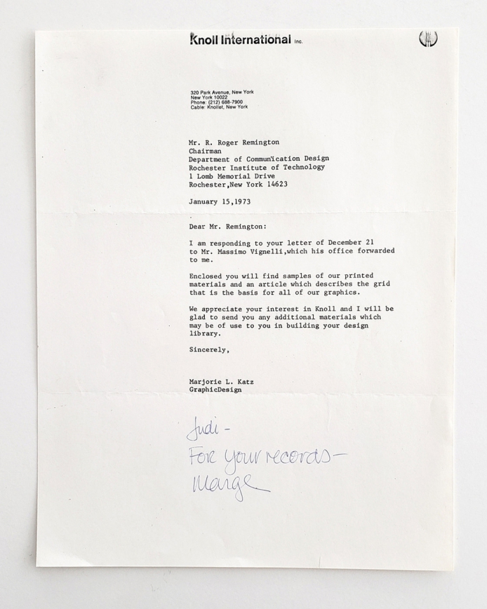
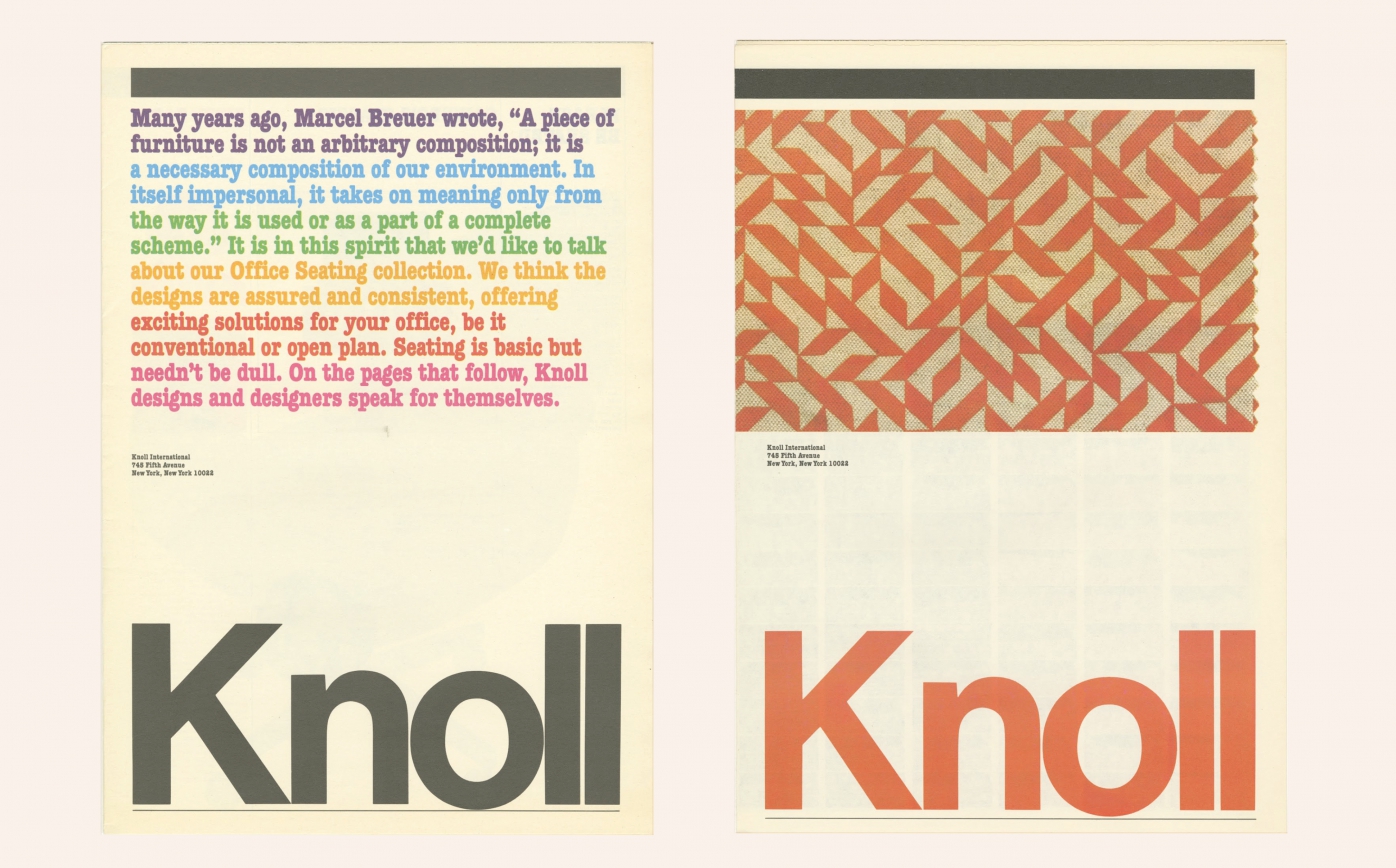
The identity initially paired Knoll International in Helvetica alongside Herbert Matter’s iconic 1947 Knoll ‘K’ logo. Seen above in a 1972 invitation in the style of a swing tag. And below in a poster, a collection of brochures from 1966 onwards from MoMA’s design collection, a price list and letterhead. The monumental 81.3 x 120.7 cm poster (1967), uses transparent and overlapping letters and underscores Knoll’s identity through typography. The reverse displays drawings of Knoll’s furniture line, which gained visibility when the poster was folded and sent as a mailing piece.

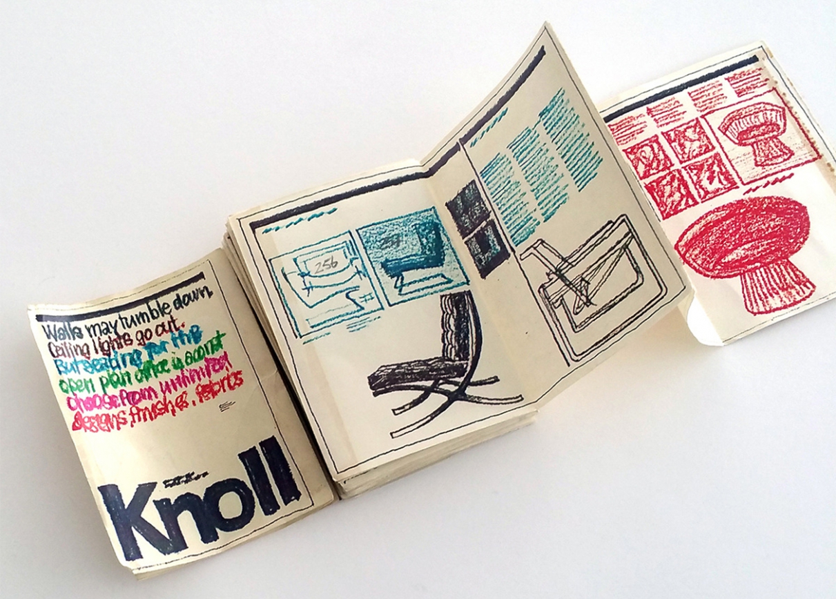
By the early 1970s the Vignelli’s had introduced their signature heavy black stripe (also a feature of their NYC subway way-finding signage) and were gradually phasing out Matter’s ‘K’ logo from the various collateral. Below is a small hand-drawn mock-up for the Knoll tabloid style catalogue from the 1970s alongside the final pages. The tabloid was meant to be a change from the sleek brochures of the 1960s and have an underground feel of the 1970s.
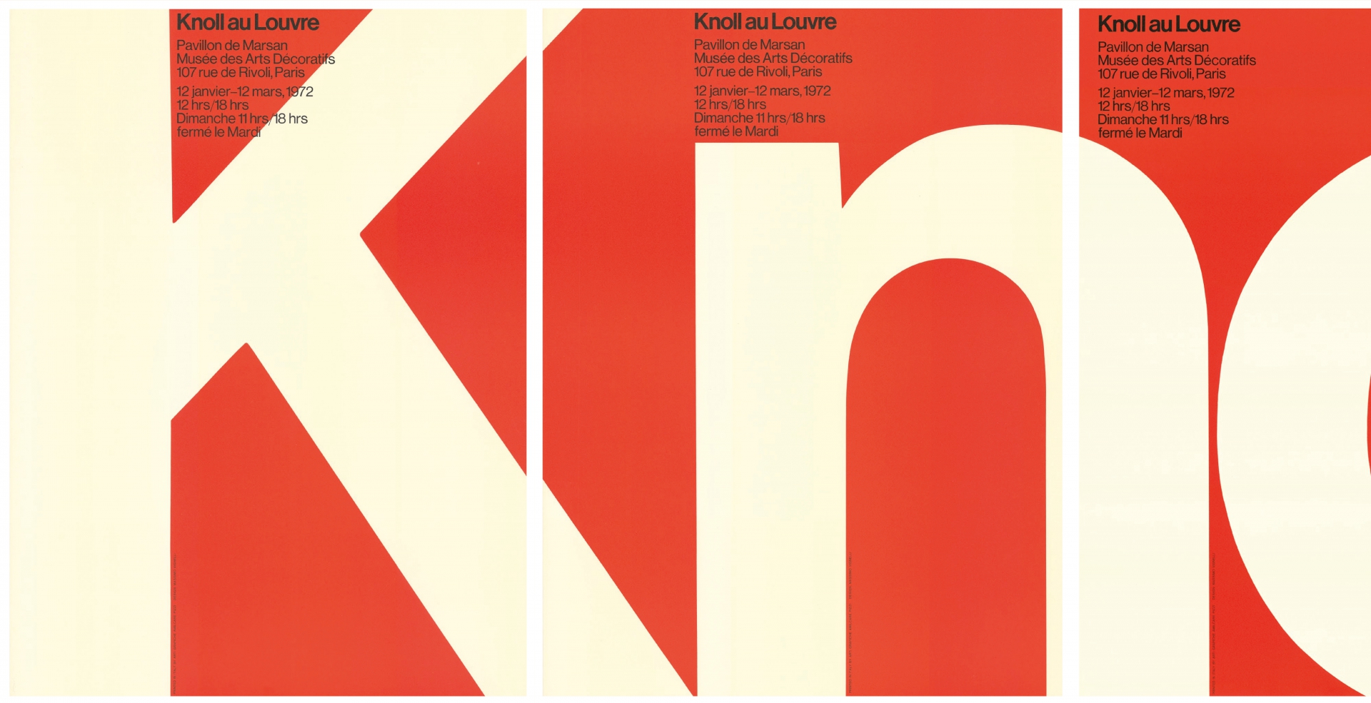
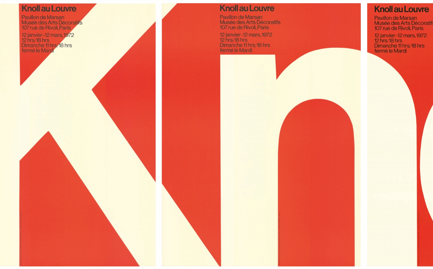
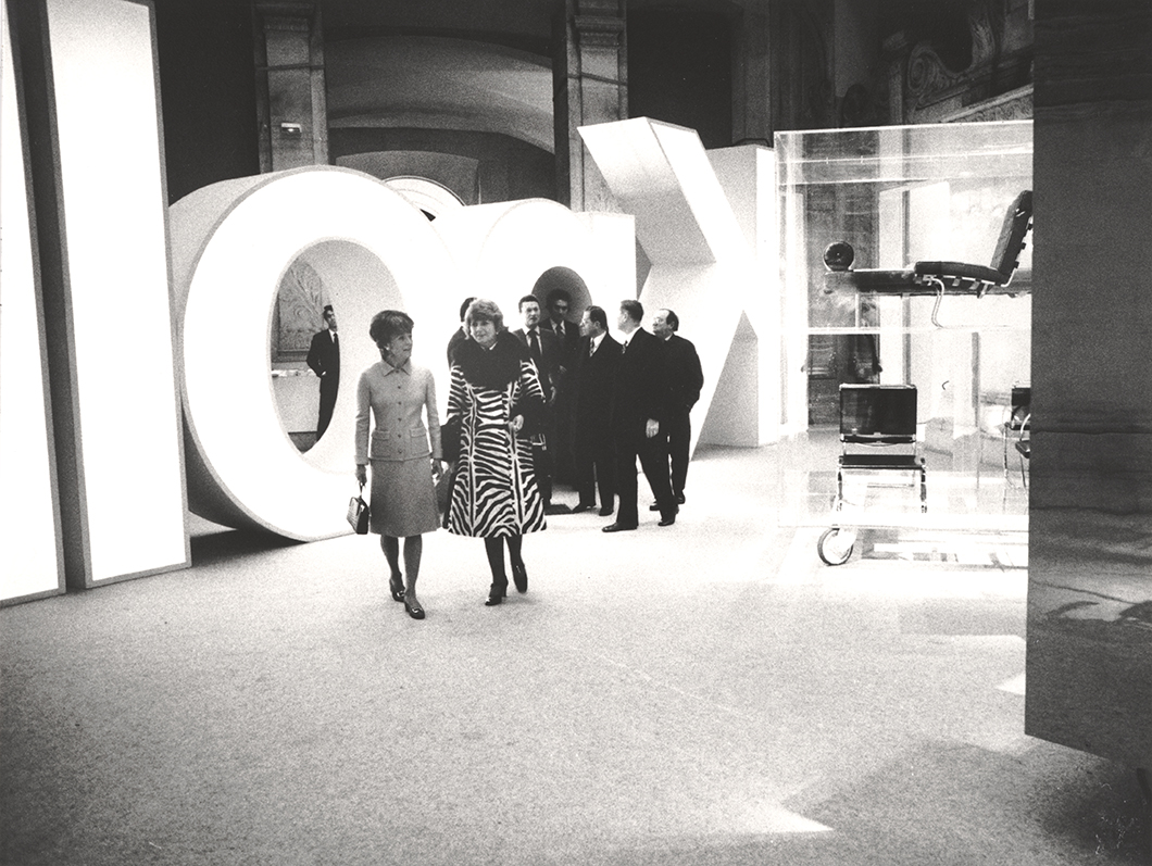
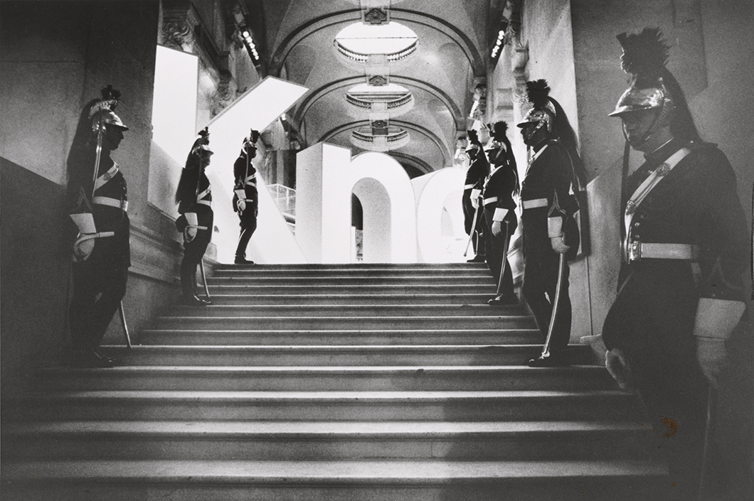
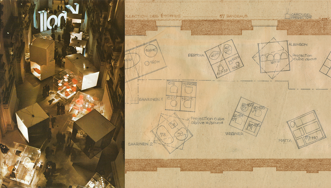
In 1972 the Knoll Au Louvre exhibition heralded a new era for the Knoll company, introducing modern furniture into leading art institutions. The exhibition design and catelogue by the Vignelli’s recieved great acclaim, and by this point, the pair’s sans serif Knoll logo was synonymous with the company itself.
Massimo Vignelli once described the Knoll assignment as “the most exciting, rewarding” of their professional career. Perhaps the greatest measure of the program’s success is the extent to which it continues to inform the company’s public identity to this day.
Related Stories
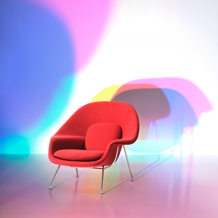
Womb Chair at 75
“I told Eero I was sick and tired of the one-dimensional lounge chair… long and narrow. I want a chair I can sit
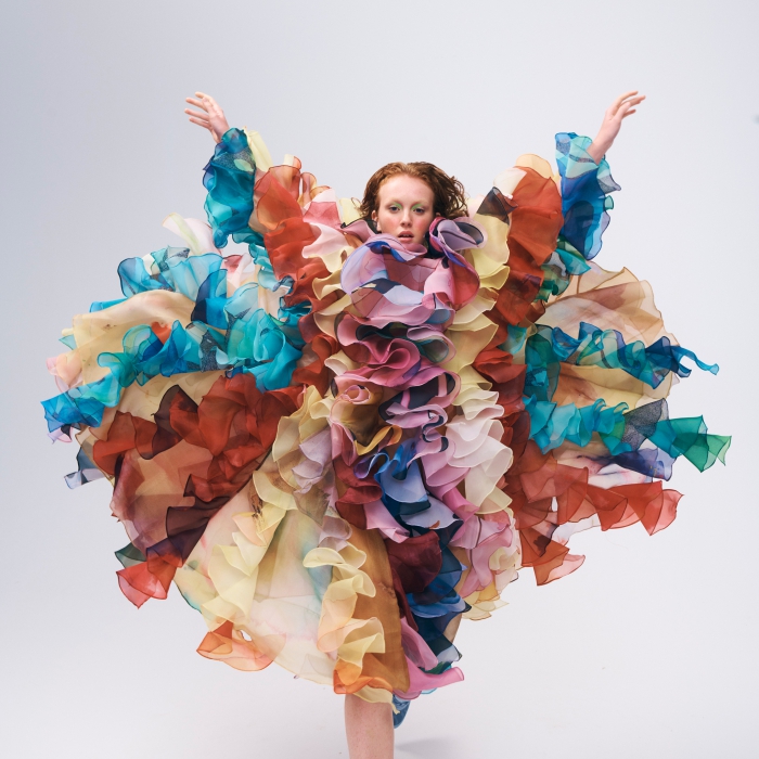
Romance Was Born Fall 2022
Romance Was Born has a history of interesting and innovative collaborations with Australian artists and designers.
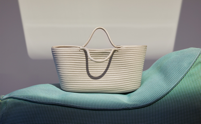
Paola Lenti Summer Colour
The colours of Paola Lenti’s handmade bags pop with joy under the Coelux ‘sun’ in our Sydney showroom. Art director
Davide Groppi at Salone
Davide Groppi’s installation Buio for Fuorisalone during Milan Design Week 2021 took darkness as its starting